Peekwink
Social e-commerce empowered by AR

Overview
This is a collaborative project where I worked with 4 other designers and researchers to design a social e-commerce platform. The concept was turned into a start-up, with our project lead the founder and other designers, including me, the core foundation members.
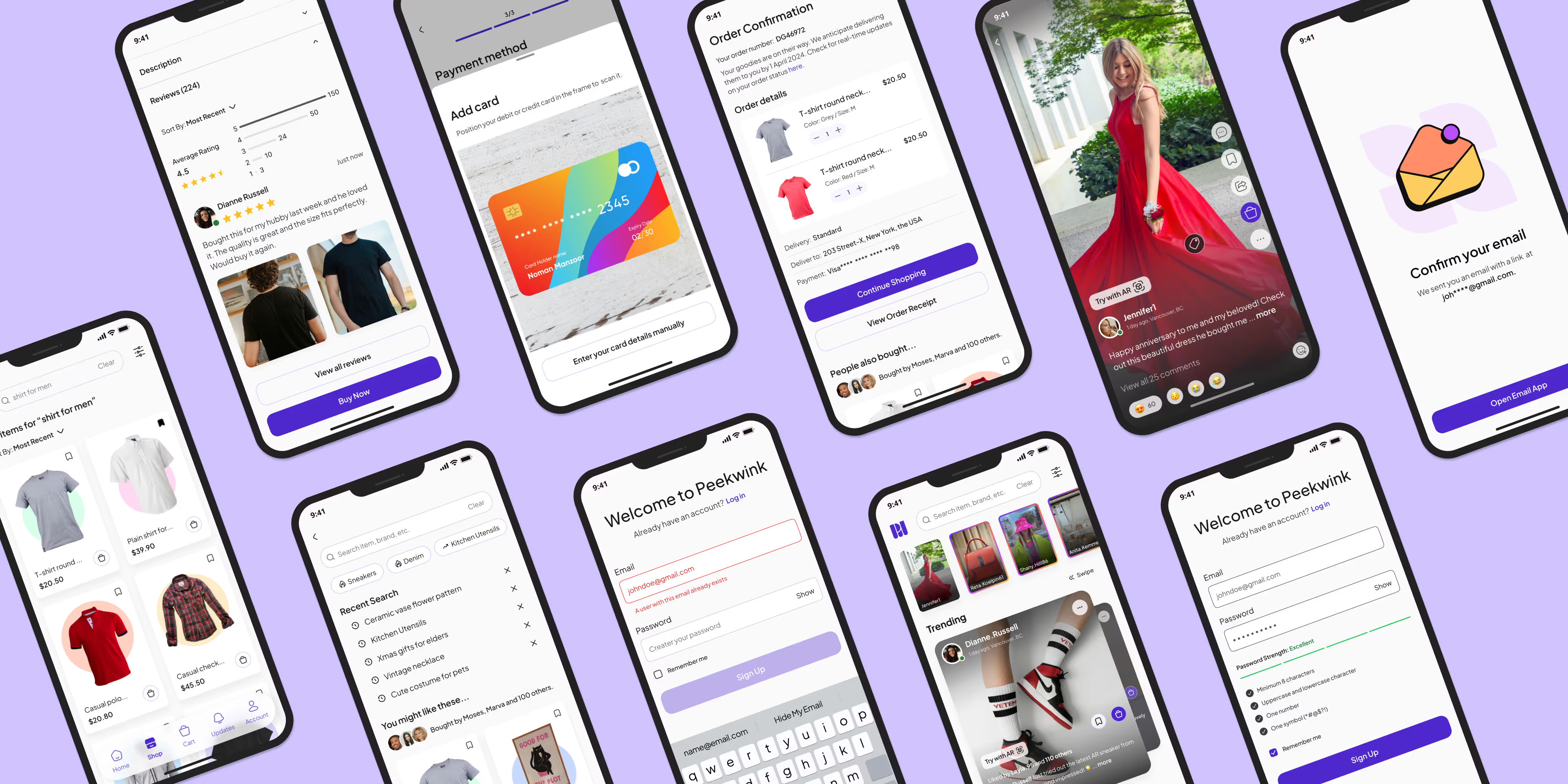
This case study covered the initial stage of the start-up development, including creating our brand identity and designing some main features of the platform, in which I participated actively as a visual and UI designer.
Problem
Social media users need a platform specialised for e-commerce products and for sharing their shopping experiences.
Social media users cannot directly search for shoppable products via categories and they lack dedicated spaces for sharing their shopping experiences. Augmented Reality (AR) are on these platforms is mostly limited to entertainment filters rather than practical shopping applications.
Moreover, online shoppers, especially those buying clothing apparel, seek to make informed choices before purchasing to minimise the need for returns.

Solution
A platform that combines AR with social commerce, providing users with an engaging and shareable shopping experience.
Social commerce - an increasing shopping trend

Augmented Reality (AR) and its impacts

Vision Statement
A revolutionary platform seamlessly fusing Augmented Reality (AR) with social commerce to deliver an engaging and shareable shopping experience.
Users can virtually try on products or visualise them within their living spaces creating an interactive AR-powered wishlist to help them make informed decisions and share their unique experiences with a global audience, democratising visibility for brands of all sizes.
The platform leverages the robust social media presence of both everyday shoppers and influencers to amplify product traction.
Process

1. Research & UX
Research Deliverables
Our research team had done a great job conducting a secondary research and competitive audit.
Their market research report gave us insights into social commerce platforms, AR's impacts and other information.
Their competitive audit, on the other hand, was clear and detailed, which was beneficial for our next stages.


UX Deliverables
Based on the research's findings and with hard work, our UX team members created 3 user personas representing our target audience, along with well-crafted strategy board, sitemap and user flows.
These deliverables made a foundation for us to move into the ideation phase.
2. Wireframing
Crazy 8s Sketches
We started our wireframe creation phase with a Crazy 8s group activity, where we brainstormed for common but indispensable screens: splash screen, home and onboarding.
Then, we worked in pairs to conduct a similar practice for more specific features, before moving into designing low-fidelity wireframes.


Mid-fidelity Wireframes
Based on the low-fidelity sketch and the team's feedback, we created mid-fidelity wireframes.
Mid-fidelity screens were crafted using Figma, with more details to some extent, to help other team members easily visualise the user interface.
3. Visual Design
Moodboards
I was assigned to create mood boards and present them to the team.
I worked closely with another UI designer and came up with 4 different mood boards, each of them had a distinct style and conveyed a unique message to the audience.
The 4 mood boards were showcased for voting. While option 3 was most voted for, the colours, typography and illustrations needed further refinement.


Design System
I was responsible for finalising our UI kit and building a Design System that provided design standards on how our platform should look and feel.
It was complex and time-consuming work, but I was glad it would keep our design consistent and strengthen our branding, even after the project finished.
Animation
There was a task that I found more fun than creating a brand logo, and that was to create a splash screen. It took a couple of attempts to get it right and the team loved the finalised version.
I also work on other animated confirmation screens and micro-interactions, which elevate the prototype's usability.

4. Final Mockups


Reflection
This social commerce platform project was very eye-opening and innovative. It has brought me closer to being familiar with modern solutions like social commerce and augmented reality (AR). In addition, this project was even more special, since this was the first time I became a core member of a start-up. I had a chance to play roles and do tasks that I may not be able to on other projects.
While working for a newly established start-up, one of the challenges I faced was balancing innovation with usability. As our leader was eager to introduce new solutions and create cutting-edge features, I needed to make sure these elements were not only attractive and easy to use but also realistic to develop.


